|
|
Post by spudafett on Sept 8, 2010 7:42:28 GMT -5
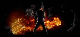
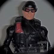
a progression of art manipulation... I wanted a "scuba team six" battalion emblem or patch that I could then put on all my figures and the A.S.A.P. scuba sub... so I knew 3 things, it had to have eith st6 or scuba team six on the front in aurebesh, a scuba clone, and the eel-fish that's on the scuba clone's pack. so I found an image of the fish (called a keelkana btw)  and an image of some scuba clones:  I downloaded GIMP and used it for this project... I first cut out the mon cal on the keelkana and edited the hell out of that image until it was basically line art:  I then took the scuba clone from the top left and cut him out, then used the sharpen and blur tools to distort the image, I also used a "cartoon" mask and then a "photo-coppy" mask to render it into a line-art like feel...  then I put the two together into a patch like form with black and gold trim rimenescent of the shield emblem we have as the logo here on the top of the page, but with blue on it too... I then downloaded an aurebesh font and used it to type "scuba team six" along the bottom:  then I textured it:  I liked it... but it just didn't seem finished so I made up some other version that simply had st6 on them roman numerals with simply VI:  and st6 in english:  and then ST6 in aurebesh:  I like the last one the best.... what about you guys? epic win, or wasted morning? |
|
|
|
Post by Dark Horse on Sept 8, 2010 9:14:05 GMT -5
Great work, but I think the Clone is a bit hard to make out after he's been posterised.
And the big logo should definitely go behind the characters.
|
|
|
|
Post by spudafett on Sept 8, 2010 9:32:28 GMT -5
k... i'll rework the scuba clone and try and get a better version of him and then try and get one with them in front of the numbers instead. It's hard to see in the final pic but I tried to make the numbers opaque so that you could see them, i guess it's not transparent enough.
|
|
|
|
Post by SGCaper on Sept 8, 2010 15:51:55 GMT -5
Yeah the SC needs to be sharpened up a bit but otherwise I dig it.
|
|
|
|
Post by spudafett on Sept 8, 2010 18:03:21 GMT -5
but the general feel of the emblem is ok right? anything I should try differently?
any ideas for a different concept entirely?
|
|
|
|
Post by spudafett on Sept 8, 2010 21:22:35 GMT -5
I redid the scuba clone, used a stock image of the figure itself from rebelscum and redid the entire ensemble so that the leters are behind the clone... anyways, I started a new thread that has a poll with 4 new emblems, I want you guys to check it out and vote for your favorite variation. st6customs.proboards.com/index.cgi?board=art&action=display&thread=5035&page=1it's in the art section since that's a more appropriate place for the final product. |
|